This afternoon I return to a recurring theme: framing (literal and figurative). Whether framing an icon like the quintessential Adirondack chair, local vintage artifacts, or Rosslyn’s buildings and grounds, composing a structural context, framework, or enclosure for supporting or enclosing intrigues me. I’m moved to contemplate the many ways framing structures, directs focus, and defines.
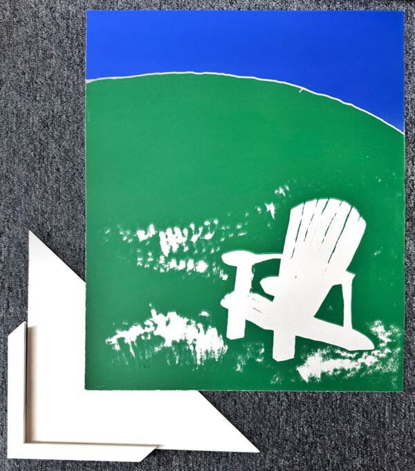
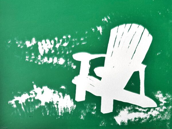
Today’s update showcases a favorite lithograph by Amy Guglielmo, albeit with a twist. I’ve been fortunate to own another pull from this original 1997 edition for a quarter century. Same abstraction of blue water and green grass, but the Adirondack chair differs notably in the original. Originally this Adirondack icon was printed in deep green. But in this artist’s proof the third and final color has not been printed, so the chair remains white, the color of the paper.

In the photograph above we’re experimenting with matting and framing. This is only the most recent collaboration with the good folks at Furchgott Sourdiffe Gallery .
With the help of… Nico Sardet at Furchgott Sourdiffe Gallery in Shelburne I’ve started to finalize… framing… This remarkable rendering will make its next appearance once framing is complete and it’s hanging in the soon-to-be completely rehabilitated icehouse.
(Source: Framing Rosslyn)
And another recent mention.
After a year of icehouse rehab, it’s been rewarding to add art… [I’ve] returned from another creative collab with Nico Sardet at Furchgott Sourdiffe… [matting and framing] that will be displayed in the icehouse.
(Source: Framing Vintage Artifacts)
White mat, white frame. Offsetting the stark white chair. Emphasizing the anomaly referenced above. Floating the green/blue abstraction. Integrating this brightly colored artwork into the subdued, mostly neutral palette of the icehouse interior.

As an A.P. (artist’s proof) this print falls outside the edition. It is an artifact that allows a voyeuristic glimpse into the printmaking process. An incomplete artwork. Arrested development. Creation interrupted. A sneak peek into the artist’s imagination, into her creative process, her exploration and experimentation.
When Amy offered this unfamiliar image as an icehouse alternative to the much loved, very familiar green-on-green original, I demurred. At first. But, little by little, I’ve come around. We are fortunate to already include the original within our collection of Amy Guglielmo’s unique oeuvre. And I’ve come to see this artist’s proof not just as a design rhyme addition to the icehouse, but as an invitation into the creator’s capricious perspective and creative process. What a privilege!
What do you think?